FAQ - What are the steps to make this comic?
How to make a comic with help from computers and AI

Now that I’ve released a few chapters of the comic I’ve been getting lots of questions asking how I’ve been making the comic. Here is how!

huangkun1985 • 2d ago •
wow, it's cool, i'm from china, i hope you can draw the whole story! and could you please share the steps for creating this great comic?
Why this project?
As a designer and illustrator who grew up loving comics and more recently, manga, I’ve dreamed of creating my own serialized comic. Recently, as I’ve been experimenting more with AI tools, I see it as a great opportunity for me to try turning one of my favorite books of all time, that none of my friends (I’m in the USA) have ever read, into a comic.
My goal is ambitious: a chapter a week, with each chapter totaling around 20 pages. If you’ve ever followed the work of professional comic and manga creators, you know how awe-inspiring their output is. They manage to produce massive amounts of content in tight time-frames, often juggling everything from story-boarding to inking and coloring—all without the luxury of automation.
For me, the journey started with a steep learning curve. It took an entire month to finish the first draft of my very first chapter. I spent much of that time experimenting with different AI models, training them to match my personal art style and color palettes, and refining my workflows to fit both creativity and efficiency.
Fast forward to this week—I just wrapped up the first draft of my second chapter, and it only took seven days. It wasn’t without sacrifice (hello, late nights and early mornings), but the difference was incredible. With AI assisting me, I was able to speed up everything, making the weekly goal suddenly feel achievable as a hobby project.
Still, I have nothing but respect for traditional comic creators who do it all by hand. Watching their process has given me a deep appreciation for the craft, and I’m humbled by their dedication. While AI helps me meet my goals, it also reminds me of the sheer talent and hard work that goes into every page, whether digital or analog.
My Workflow
Writing + Sketching First
One of the most exciting—and challenging—aspects of creating my comic has been adapting Journey to the West, specifically using Anthony Yu’s four unabridged translations as my source material. It’s a rich and layered text, filled with poetic descriptions and intricate narratives, which makes translating it into a visual format both thrilling and intimidating.
My process begins by going through the text line by line, imagining how each scene could unfold visually in a comic. It’s not just about illustrating what’s written—it’s about reinterpreting the story to fit the dynamic, visual language of comics.
Once I have a rough mental image of the scene, I start story-boarding on paper. This is where I sketch out the flow of each page, panel by panel, and think about how to communicate the action, emotion, and pacing effectively.
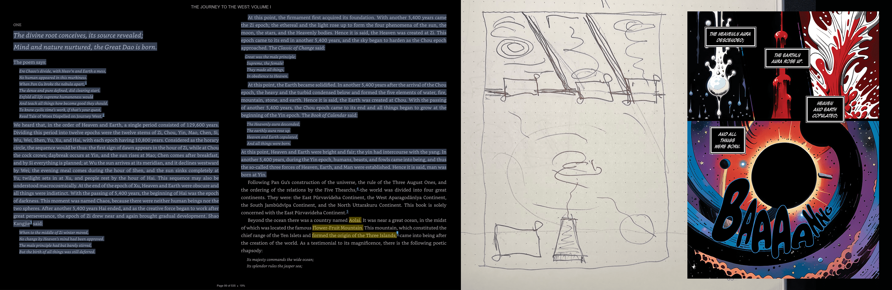
A big part of the adaptation process is rewriting. What works in a novel doesn’t always translate well to a visual medium. For example, the original text has a call to action from the group that is important to the story. It is a dialogue between a group of individuals who happen to be fun-loving monkeys. The way it is written right now sounds like a biblical proclamation, and it doesn’t feel right if monkeys say it.

I like to imagine if this were a movie, or tv show. What would these silly monkeys be doing and saying if they were in an anime released in 2025? I think it would sound more like a conversation some kids might have together.
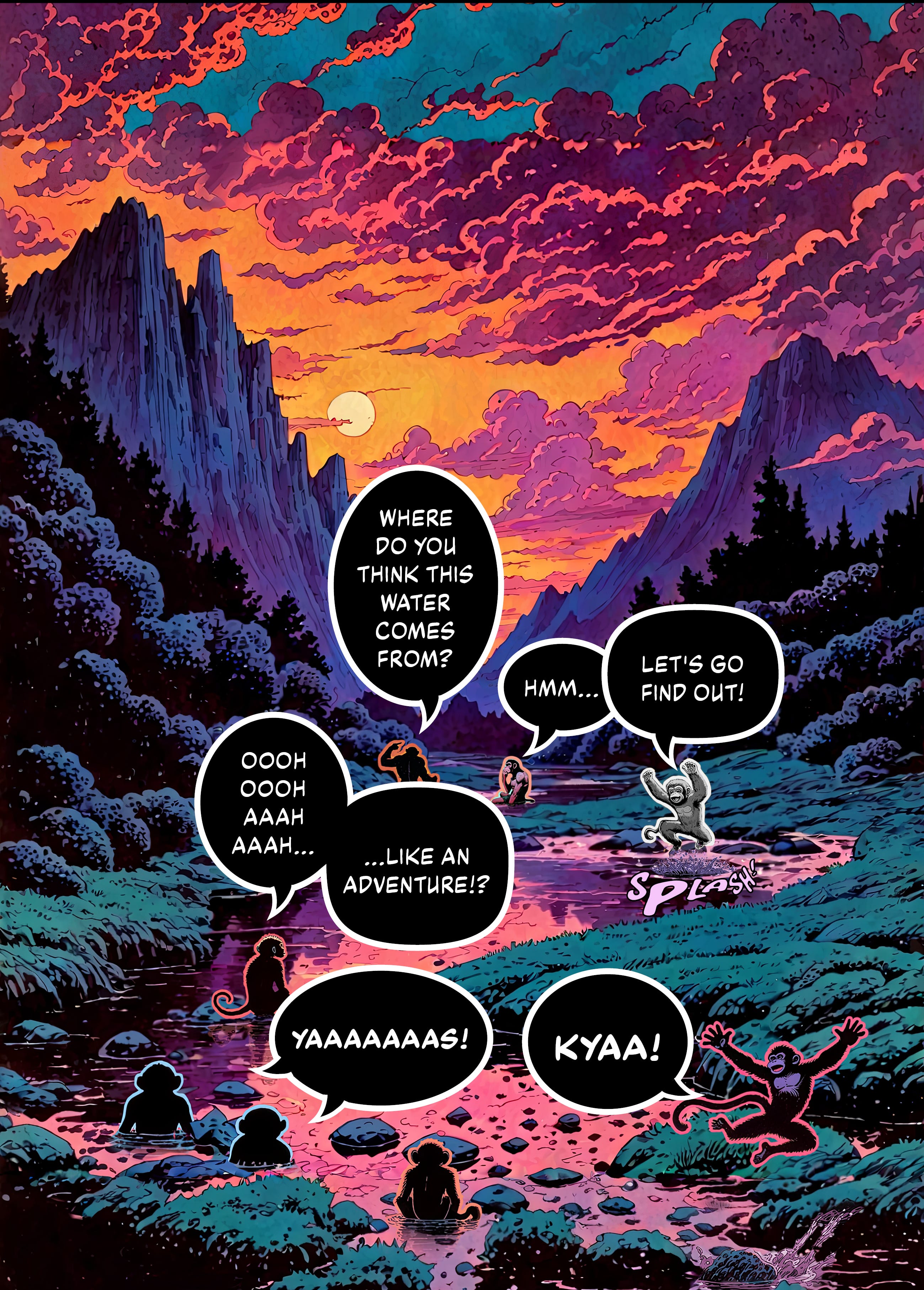
While playing in the water, a monkey says to the group, “Where do you think this water comes from?”
This is much more conversational than the original: “We do not know where this water comes from”, and reads much better in a comic format.
I like to imagine an eight-year-old kiddo reading it. If it makes sense to them it should make sense to everyone.
This process—balancing fidelity to the source material with the demands of a different medium—is both a challenge and a joy. It forces me to think creatively about storytelling, and it’s been incredibly rewarding to see these classic epic scenes take on a new life in comic form.
Page Layout
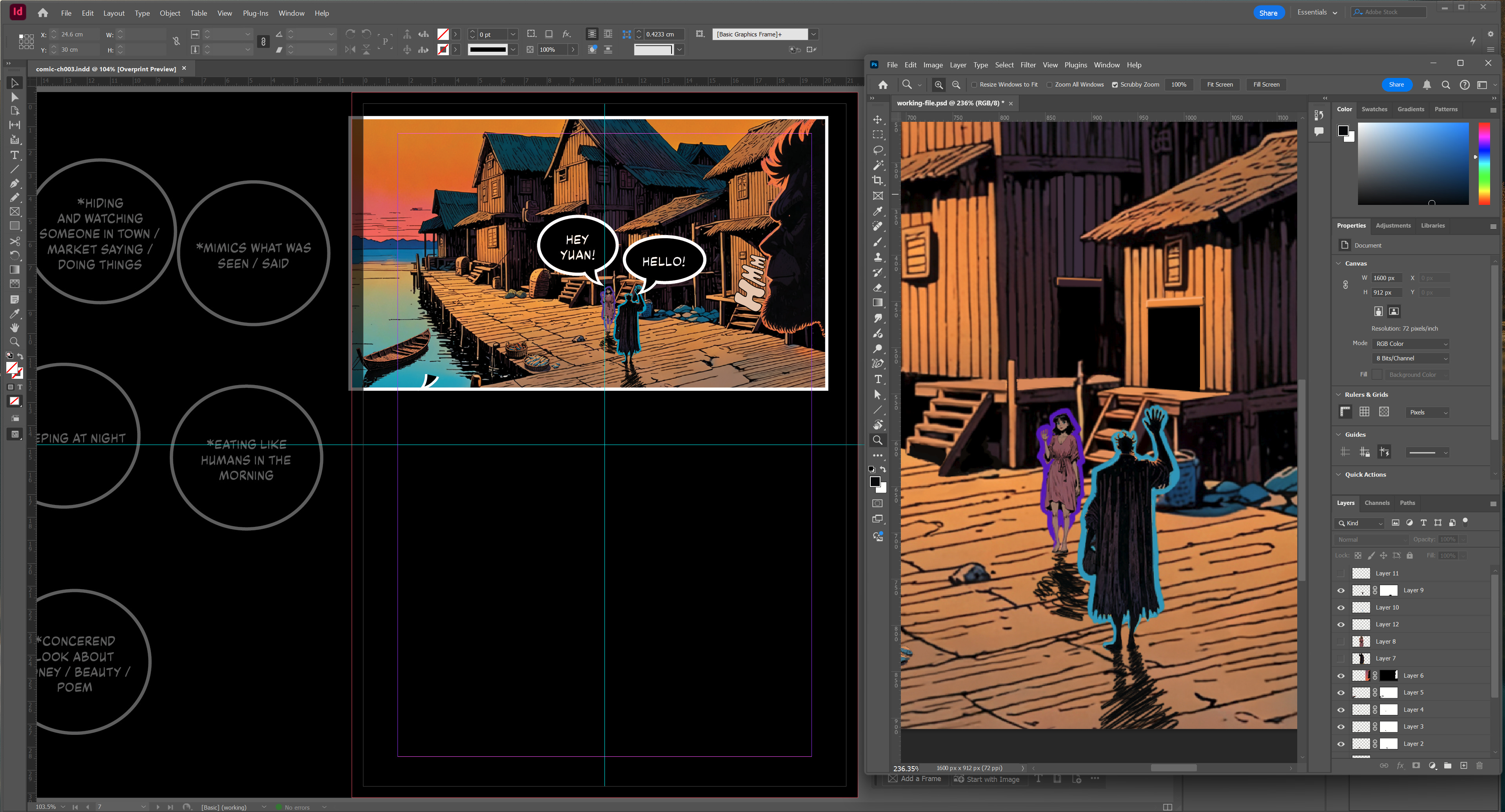
For page layout I’m using Adobe InDesign—a tool I’ve used in the past to create hundreds (thousands??) of books and magazines.
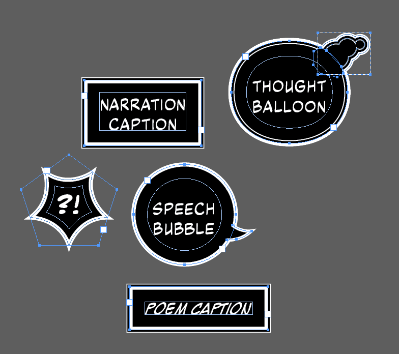
I start by writing out the copy for the page, making sure to use the right types of boxes with the right fonts for the right types of content. I have five types of boxes right now, and only the poem box uses a different font from the other four.
Speaking of fonts, they are all from blambot and are either free or very reasonably priced.
With the dialogue in place, I create placeholder content boxes for the images that will accompany each line of text. These boxes align with my initial sketch, helping me visualize how the final page will look and ensuring that the text and artwork complement each other seamlessly.
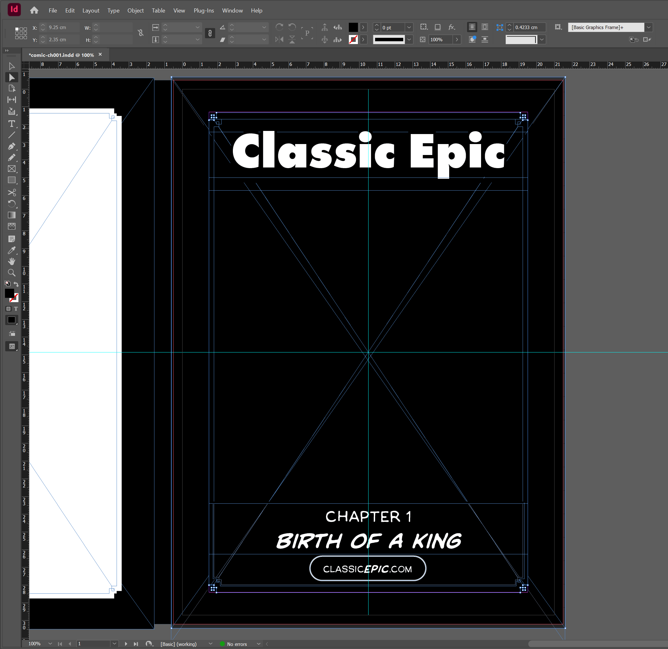
This rough layout gives me a clear roadmap for the next step: illustrating each panel. By having both the dialogue and the visual structure ready in InDesign, I can focus on drawing and refining the artwork, knowing exactly where everything will go on the page.
Illustrations
Once my page layout is ready, it’s time to bring the visuals to life. Choosing the right AI tool for image generation has been a journey in itself. I’ve experimented with many platforms and models over the past few years, and at this point, I’ve generated over 50,000 images using MidJourney alone, which is an incredible tool, and its niji model—designed specifically for anime and manga-style artwork—was initially my go-to. It delivered great results, but it still didn’t quite align with the specific style I had in mind. I wanted the final output to resemble my own art style so that I could make quick edits and adjustments without the final result feeling disconnected.
After some experimentation, I found the perfect solution: using Stable Diffusion XL (SDXL) locally with a manga-specific checkpoint and LoRAs (Low-Rank Adaptations) trained on my line work and colors. This combination gave me the control and customization I needed to generate images that felt much closer to what I would have drawn myself.
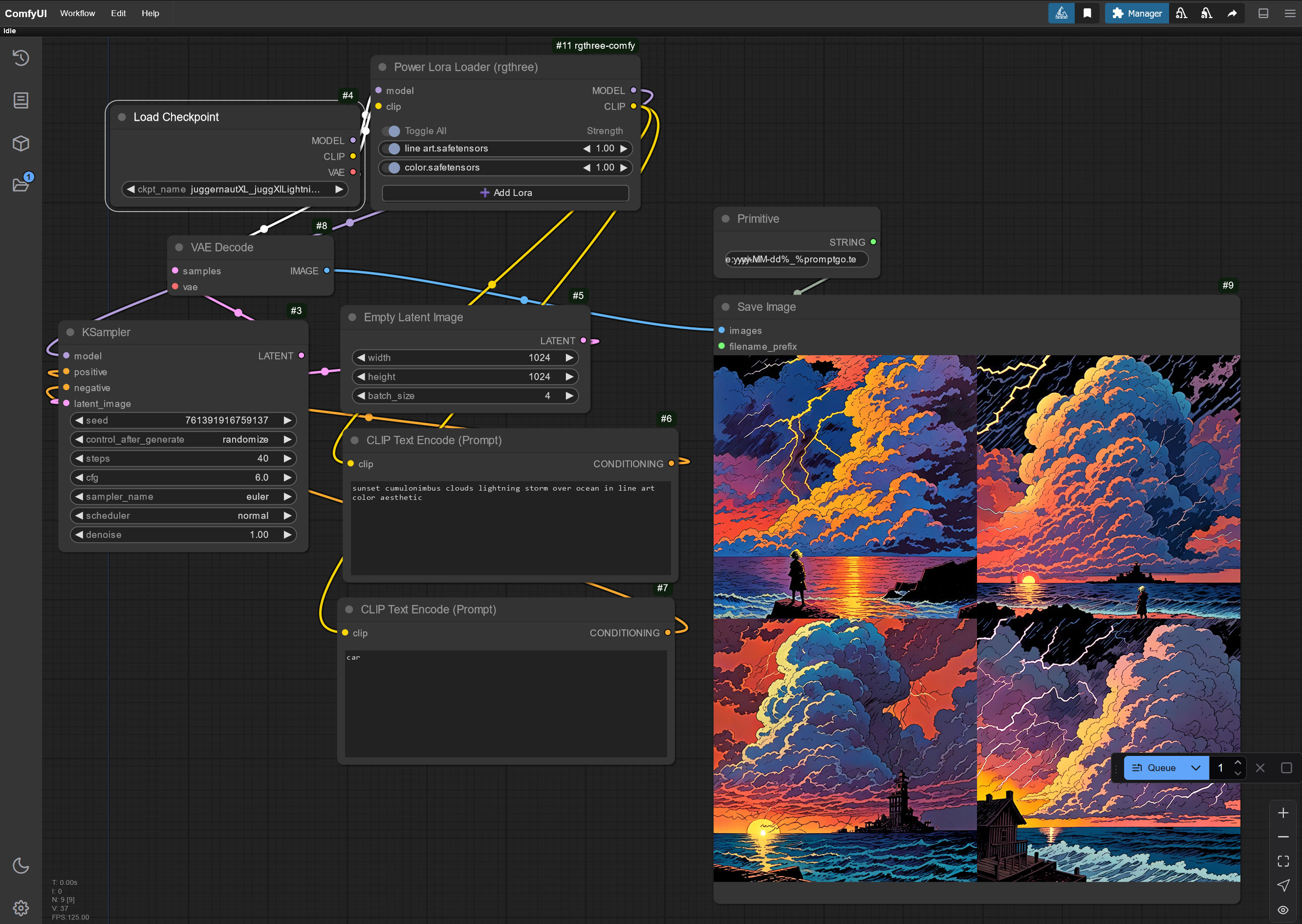
I’ve been running this setup through ComfyUI, a powerful and modular interface for Stable Diffusion. My process starts by describing my sketch in detail to the AI, hoping to generate something that matches my vision. While the first output is often close, it’s rarely perfect on the first try.
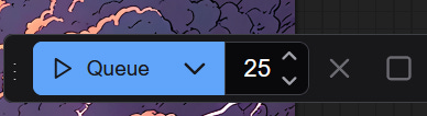
To maximize my chances of getting exactly what I need, I usually set the AI to generate around 100 images per prompt. This is way easier locally on my desktop computer than it was using midjourney in their cloud. I just set my que to make 25 batches of 4 and do something else.
While it’s running, I work on other parts of the book or I take a break—often reading manga for inspiration. Once the images are ready, I comb through them, selecting the ones that best fit my storyboard and artistic vision.
Since I’m still relatively new to ComfyUI, I’ve been learning a lot from the community and exploring pre-built workflows from sites like Prompting Pixels. These workflows help streamline the process, giving me better control over things like composition, lighting, and style consistency.
This approach allows me to generate high-quality visuals that align with my artistic style while saving countless hours of manual illustration. It’s a blend of creativity and technology that keeps me excited about every new page I create.
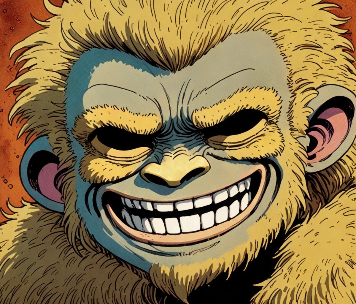
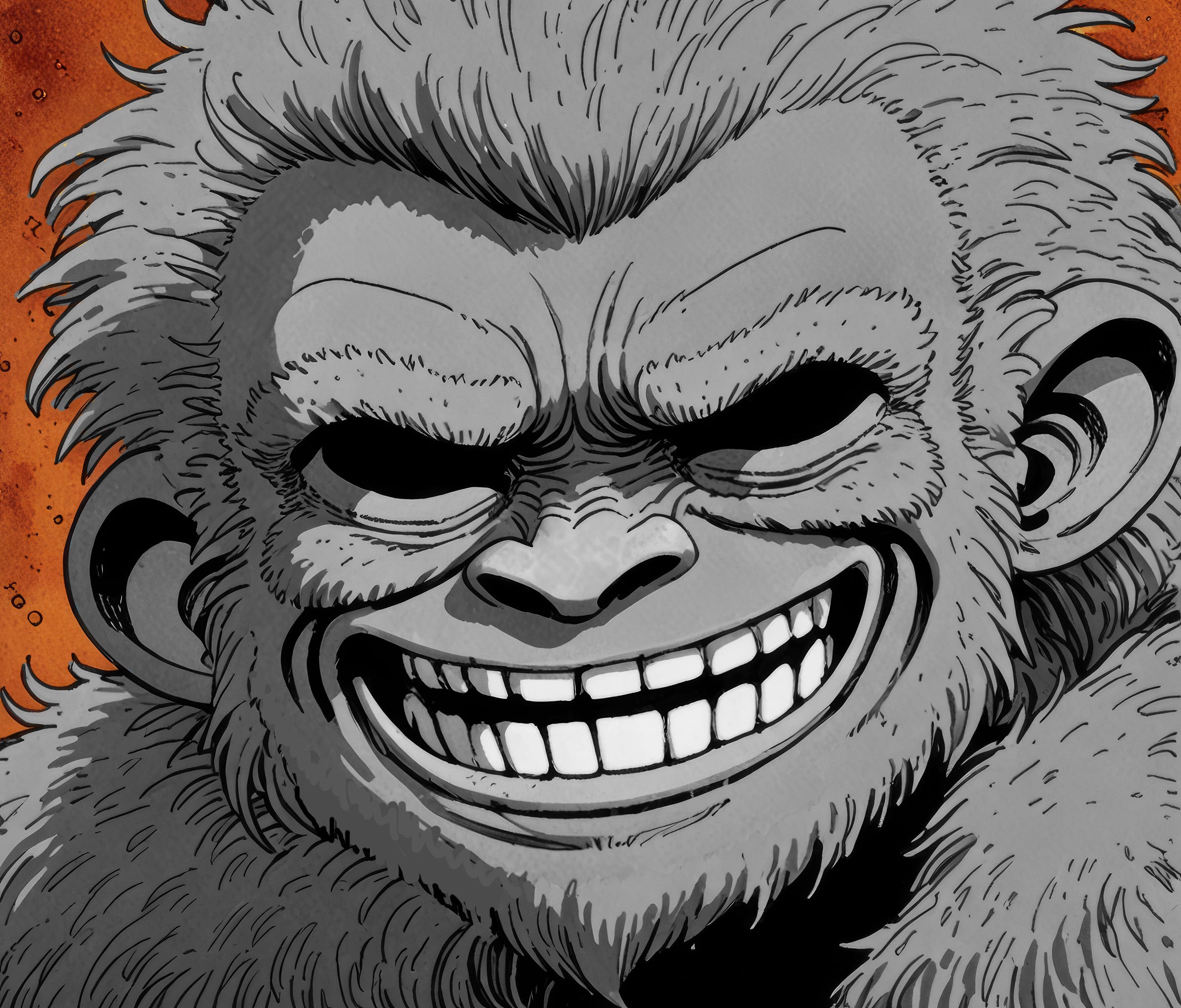
Once I find an AI-generated image that fits my needs, the real work begins—cleaning it up. No image ever comes out perfect, and more often than not, there are significant flaws that need fixing.
For example, the coloring might be off, requiring me to recolor certain areas to match the overall tone and style of the comic. Other times, the anatomy is completely wrong—like a character having three hands instead of two, or fingers that somehow multiply into six. In cases like these, I manually draw over the extra limbs and clean up any distorted details.
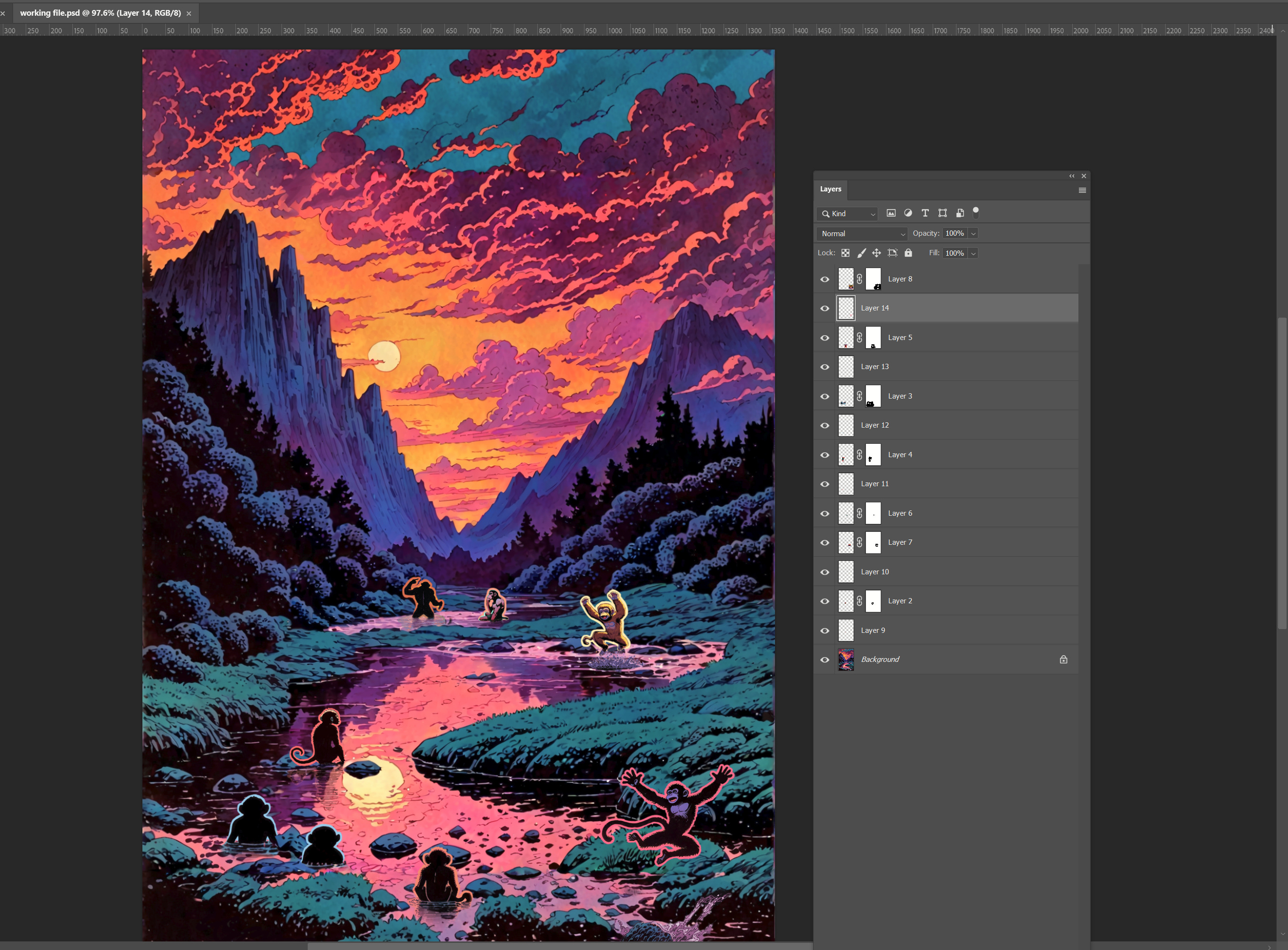
In some cases I’ll compose large images from multiple sources and using multiple tools. For example, in one scene I wanted a really pretty mountain background with good clouds at sunset with a winding river with multiple monkeys playing and jumping and pointing and contemplating. I couldn’t even get a good background!
Here is an example where I created a scene with 3d models in clip studio paint and then used image to image ai methods along with hand cleanup in photoshop:
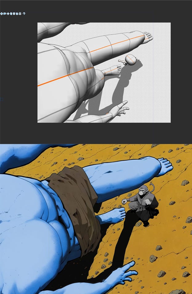
What I ended up doing for the below composition is, first I generated a good background image with a river. Then I opened that image in another comfyui workflow to do some outpainting, where I extend the image and describe what I want to see. This allowed me to extend the river and make it wind more, as well as increase the size of the image without needing to upscale it as much. I then opened the image in an inpainting workflow and masked areas I wanted the monkeys and described them. Some of them worked well and some didn’t, so I also generated new monkeys on their own and placed them in the image manually in Adobe Photoshop. Finally I added colored outlines around the characters so they stand out from the background and the reader doesn’t have to strain to make them out. There are other techniques to do this that are more immersive like using contrasting colors, using adjusting levels, etc, but this technique is acceptable too and I like the glowing effect it gives characters and objects.
Once the image is cleaned up, I take it into another AI to upscale it—making it larger and suitable for print. Since some of my background is in the print industry, working at high resolution is second nature. Plus, I dream of one day compiling these pages into a printed book.
Starting with a high-res file also gives me flexibility. It’s always better to scale down for web than to try and upscale later, which can compromise quality. This way, I’m ready for both digital and print formats from the start.
Back to Layout
After upscaling the cleaned image, I bring it into Adobe InDesign and place it into its respective panel, adjusting the text around it for a seamless fit. I repeat this process for all the panels on the page, carefully ensuring the flow of visuals and dialogue feels natural.
Once the images and text are in place, it’s time to add sound effects. These aren’t just thrown in—they’re carefully crafted to feel like part of the scene. For simple effects, I design them directly in InDesign, but for more complex ones, I use Adobe Illustrator. Each sound effect is hand-lettered, adjusted, and placed to look fully immersed in the environment. I rely on fonts from Blambot.com, which offers a great selection of free and affordable comic fonts that fit the tone of my project.
With all the elements in place, I clean up the layout—making sure everything is evenly spaced, borders are aligned, and the overall design looks polished and professional.
Review & Publish
Finally, I send the page out for feedback and critiques. This step is invaluable, as fresh eyes often catch details I might have missed. Based on the feedback, I make revisions—sometimes several rounds—before the page is ready to publish. Eventually, it all comes together, and the comic ships! :)
As for shipping, I’m getting a few chapters done and cleaned up first and I plan to launch at the beginning of 2025!
Hope this was interesting and helpful and please leave me any feedback or ask any questions.
Thanks for reading and make sure to subscribe to be notified of the launch of the first chapter and weekly chapters after that.